Paradise Corner is more than just a bookstore; it’s a modern haven for book lovers and stationery enthusiasts. My design focus was on creating a vibrant, inviting atmosphere through a distinctive geometric pattern. This pattern not only adds a contemporary flair but also reflects the organized beauty of books and stationery.
The creation of the store’s logo and stationery was pivotal in establishing a strong brand identity that resonates with customers. My goal was to blend simplicity and elegance, ensuring that every element of Paradise Corner reflects its commitment to inspiring creativity and a love for reading.
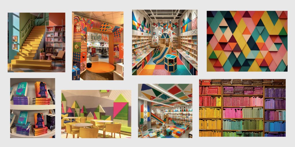
I have put together a vibrant and inspiring moodboard for the branding of Paradise Corner. The photos I have collected are filled with colorful geometric patterns and eye-catching designs that embody the lively and modern atmosphere I envision for the store.
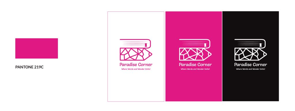
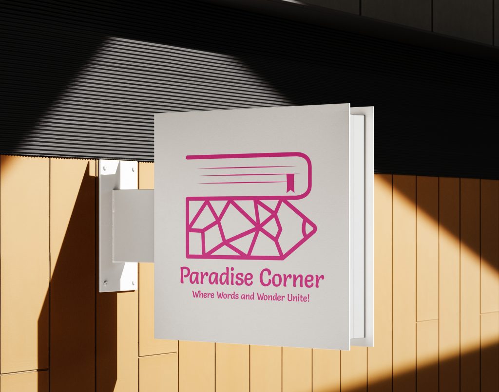
Moving to the logo design for Paradise Corner, I focused on encapsulating our bookstore and stationery shop’s vibrant essence. The final design features clean lines and angular shapes, reflecting the store’s modern geometric theme. Incorporating a pencil, a book, and the letter ‘P’, it represents a unique space. Complemented by the Salsa Regular typeface, known for its flowing characters, the logo balances creativity and approachability, perfectly aligning with our brand identity.
The chosen color scheme uses PANTONE 219C for a vibrant touch symbolizing joy and happiness and it creates a welcoming atmosphere for customers in Paradise Corner. Also, the logo stands out whether against the dynamic pink itself or a sleek dark grey, showcasing the brand’s versatility and consistent visual impact across different mediums.
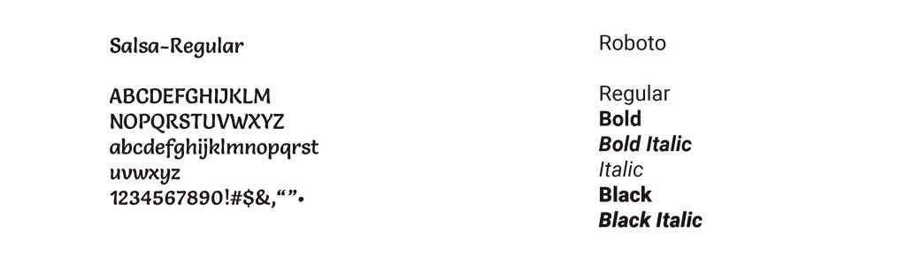
For Paradise Corner, I’ve chosen the Salsa Regular typeface for its flowing, rounded characters to enhance the logo’s appeal and align with the inviting vibe of the store. The brand guidelines feature two primary typefaces: Salsa-Regular for the logo, adding flair and readability, and Roboto for its versatility in other applications like packaging and posters, ensuring clear, consistent communication across all platforms.
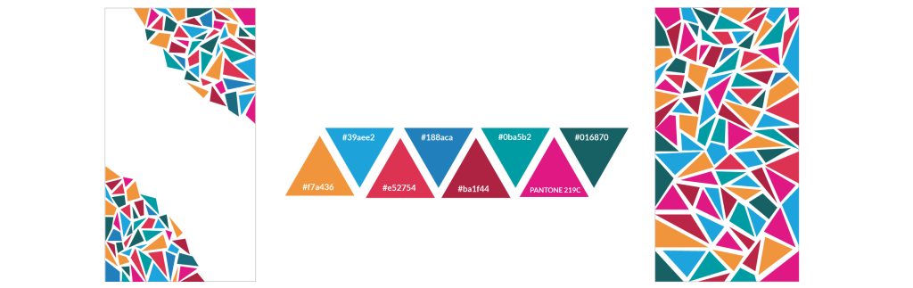
I’ve also designed two geometric patterns for Paradise Corner, versatile for branding needs. They maintain coherence across various scales, from store decor to stationery. The patterns echo the store’s geometric identity, blending soothing blues, stable teals, and energizing tones, including the signature PANTONE 219C pink from the logo. These colors create a vibrant and welcoming atmosphere, reflecting Paradise Corner’s lively spirit
These images display mock-ups of the Paradise Corner logo as it will be featured on store signage and etched onto the storefront glass, illustrating the brand’s modern and inviting presence in both solid and transparent mediums.
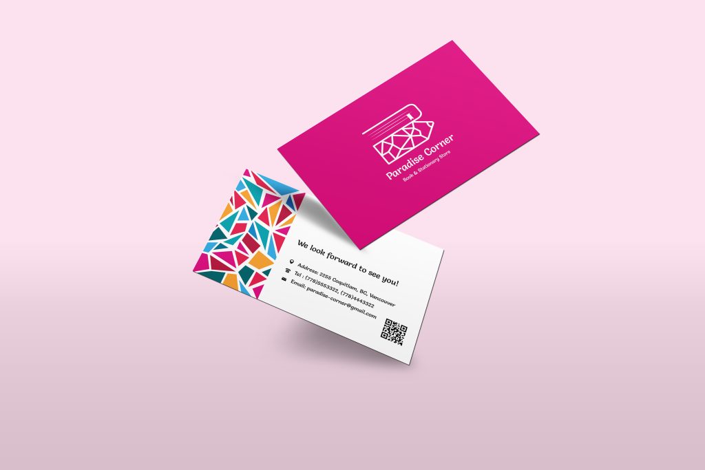
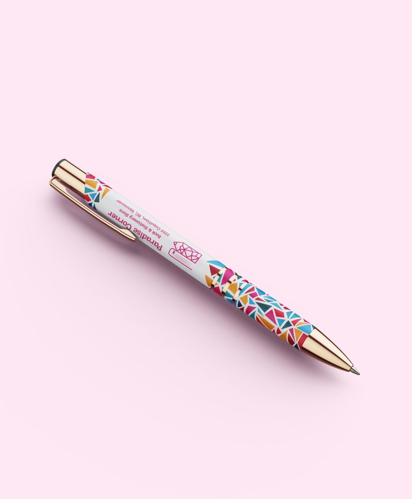
The front of Paradise Corner’s business card is a striking showcase of the logo against PANTONE 219C, making a bold statement, while the back presents a colorful geometric pattern, capturing the brand’s essence. Complementing the card, the specially designed pen, wrapped in the store’s signature pattern, serves as a memorable take-home embodiment of the store’s creative spirit.
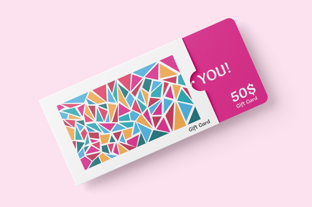
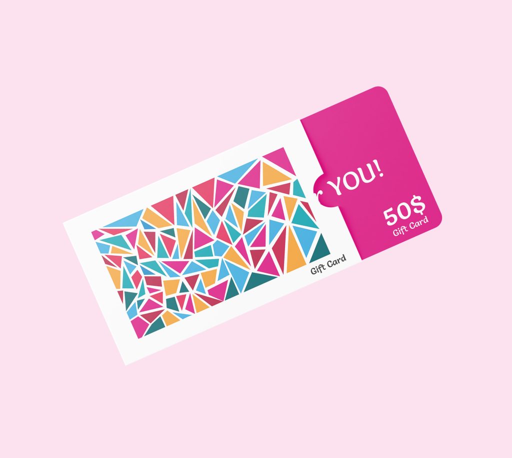
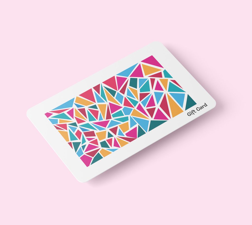
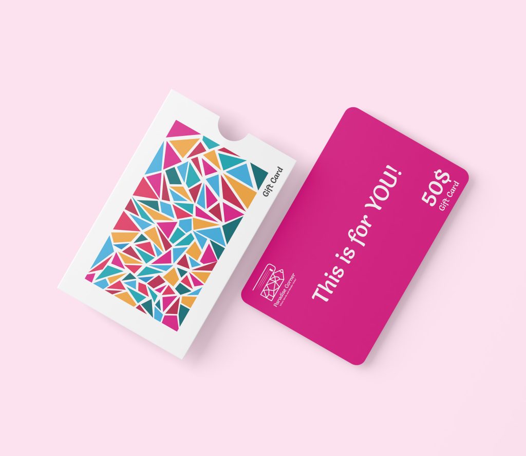
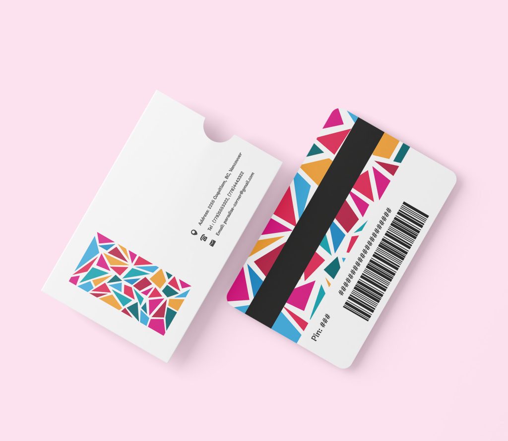
I also created a gift card and holder for Paradise Corner, combining the vibrant PANTONE 219C with the store’s distinctive geometric pattern to offer customers a piece of our creative world.
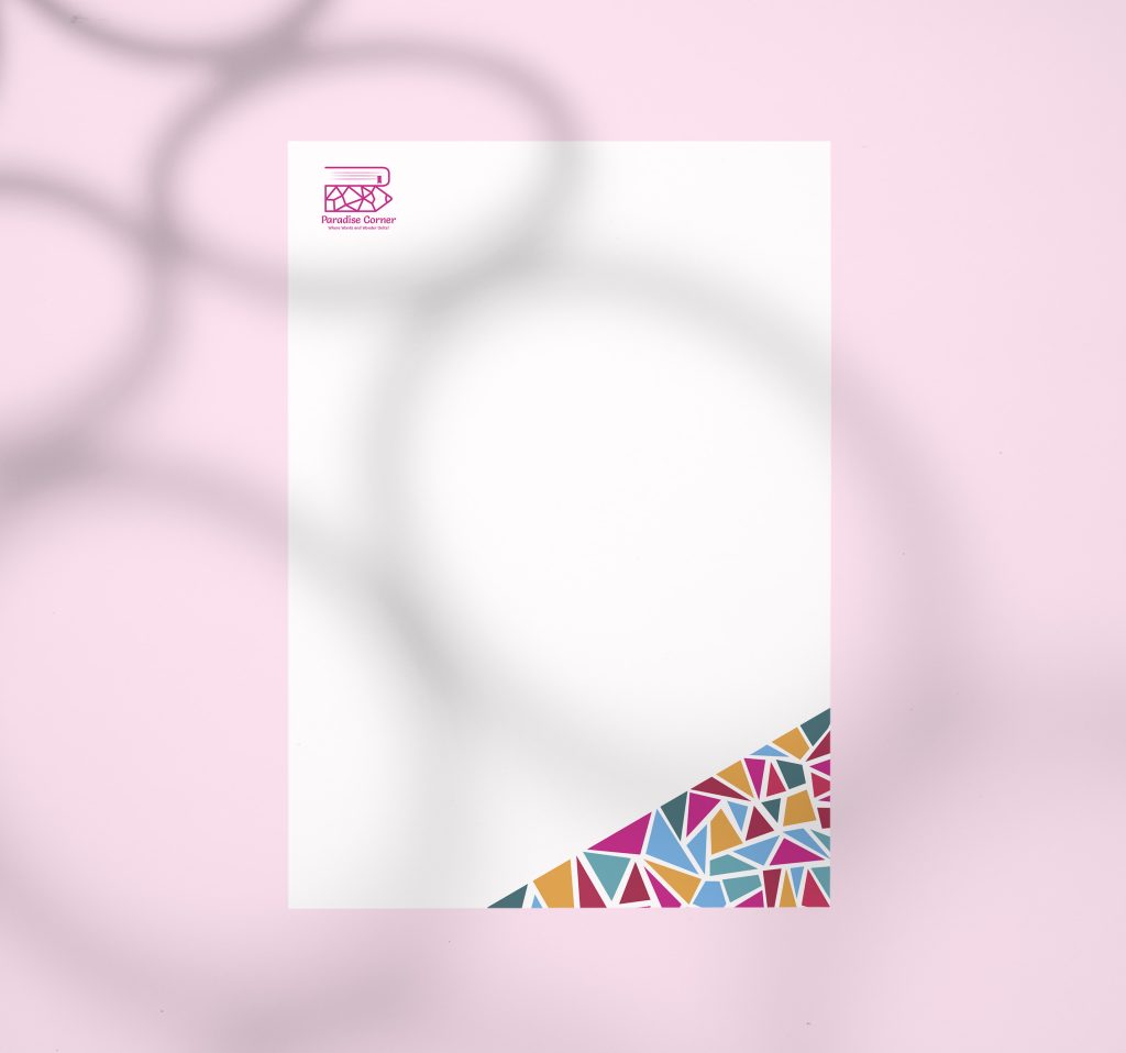
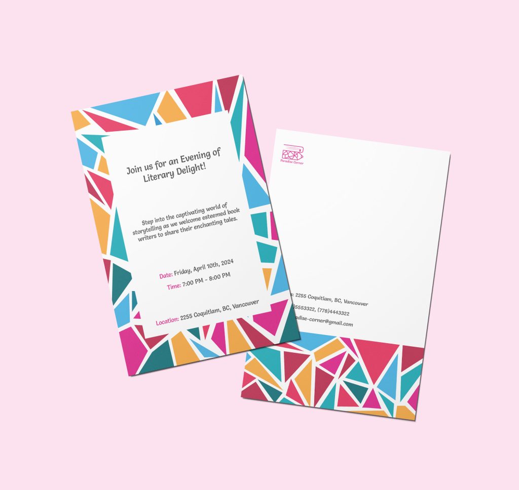
Crafting event invitations with the store’s vibrant geometric pattern prominently displayed was a delight, and the stationery paper was another stationary application I designed, seamlessly integrating our brand into everyday interactions.
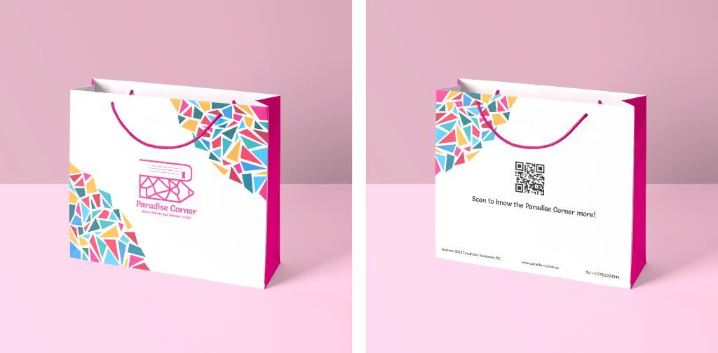
For Paradise Corner, I also created a shopping bag that’s not just functional but also a piece of art. One side flaunts the vibrant geometric pattern, and the other invites interaction with a QR code, blending utility with the store’s creative spirit.
Reflecting on the project
The Paradise Corner branding project was a success, offering valuable lessons in creating a cohesive visual identity. The combination of geometric patterns and vibrant colors effectively captured the essence of the store. This experience emphasized the importance of integrating feedback and demonstrated how a well-thought-out design can significantly enhance brand appeal. Future projects will benefit from these insights, particularly the balance between creativity and practicality in branding.