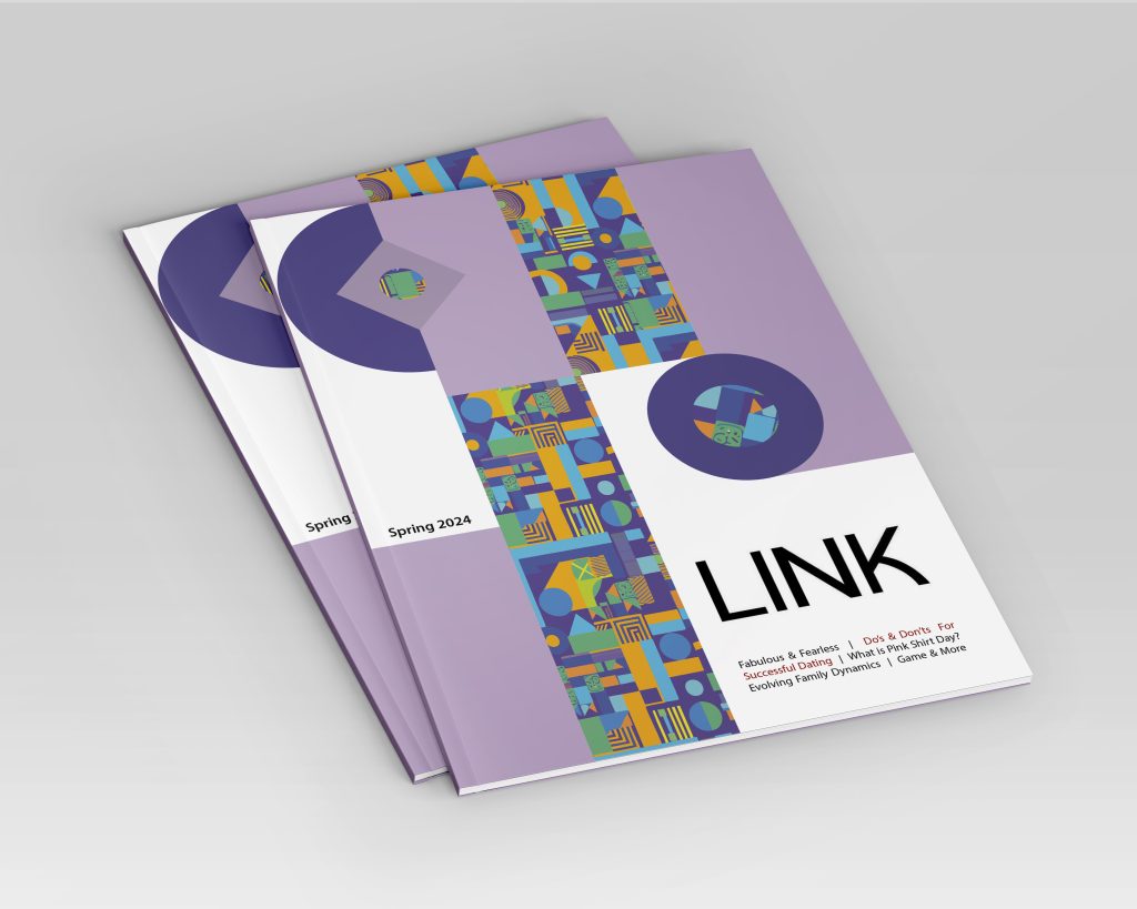
This project encompassed the complete design and illustration of the cover and two articles for BCIT’s Link magazine. My role was to create layouts that are both attractive and educational, ensuring that they align with the magazine’s visual standards.
I personally crafted original illustrations for each article, aiming to visually encapsulate the essence of the stories and to provide an immersive reading experience.
The intention was to merge clear, informative design with compelling imagery, reflecting the publication’s ethos and enhancing the value offered to its readers.
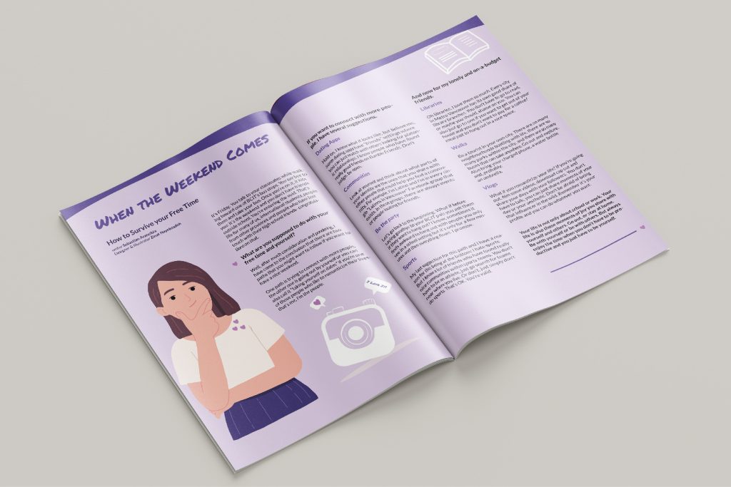
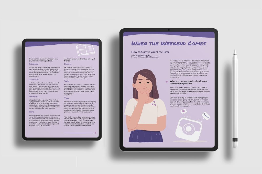
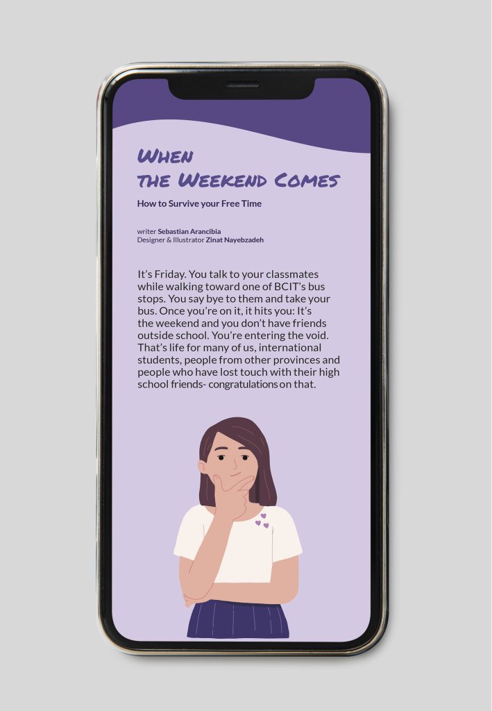
This spread from Link magazine features my design work, combining vibrant illustrations with a harmonious purple color palette to guide readers through a leisurely and informative experience.
A purple hue was chosen for its association with creativity and wisdom, aligning with the idea of wisely using one’s free time for personal growth and relaxation. I also selected Permanent Marker Regular for the title for its informal, engaging style. Lato Regular was used for the body text for readability, and Lato Bold for subtitles to highlight important sections, ensuring a clear, hierarchical flow of information.
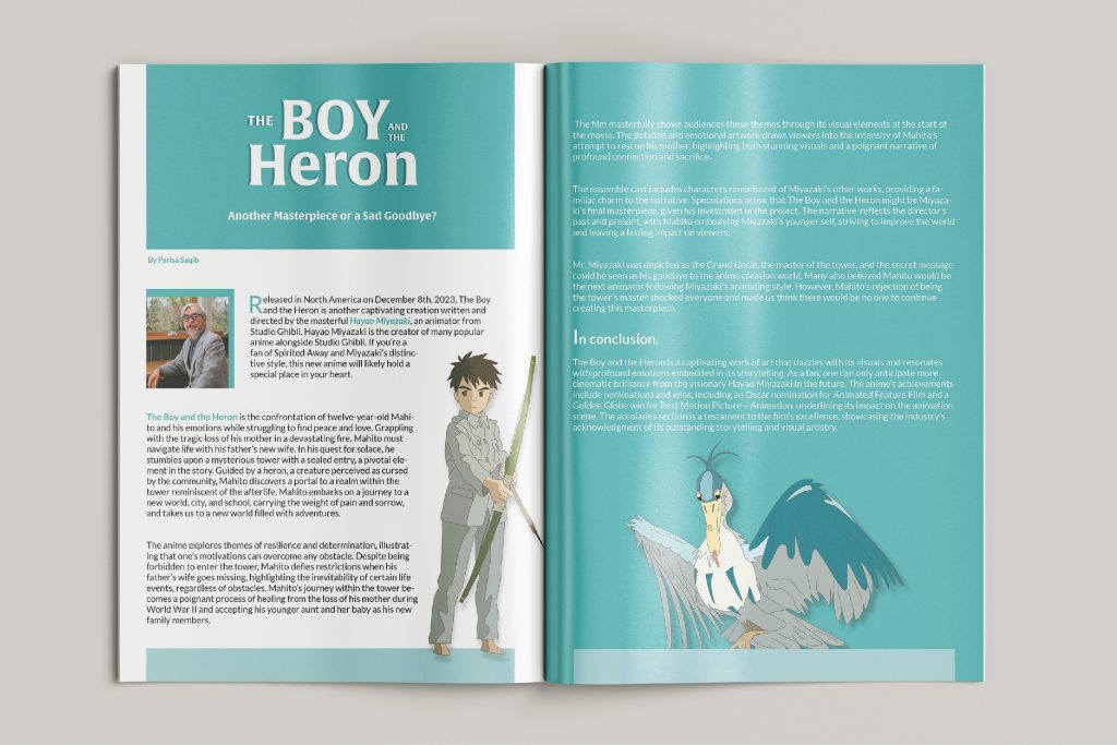
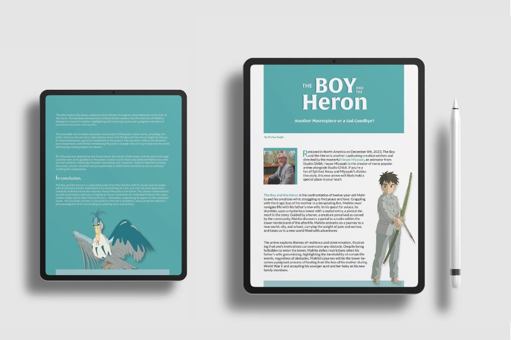
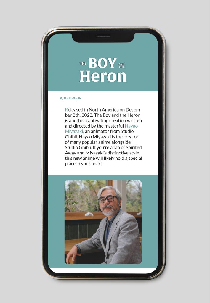
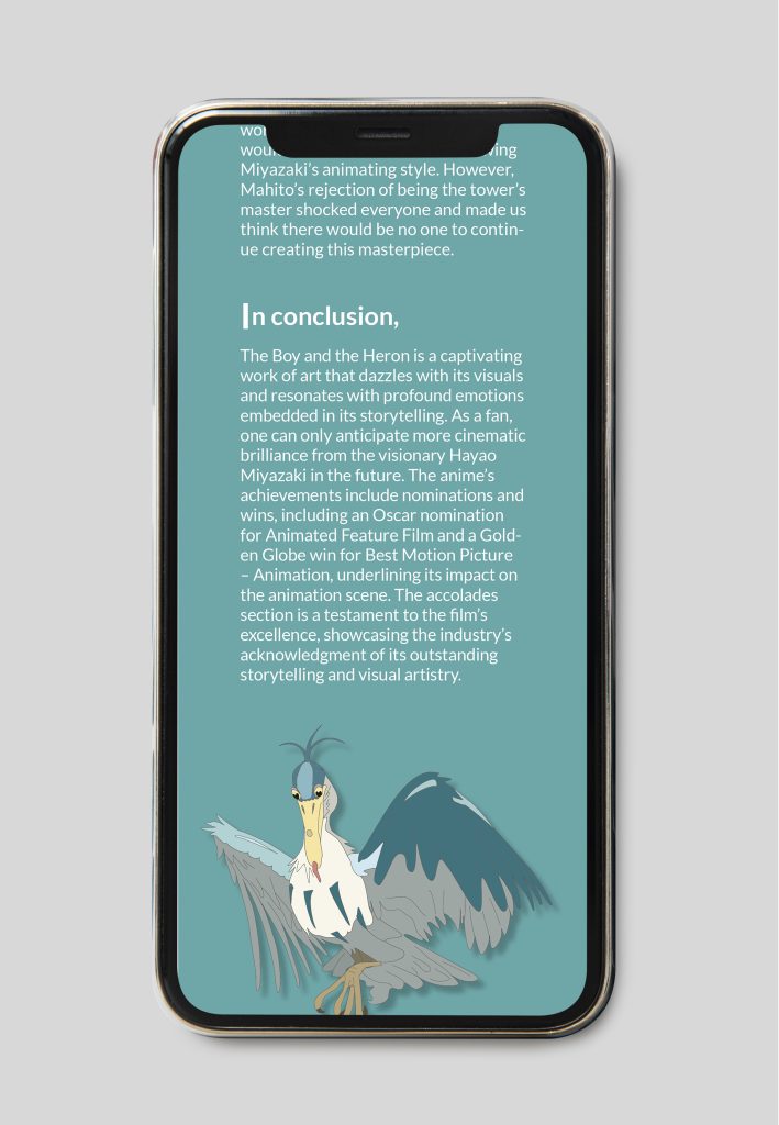
This is another article I designed for Link magazine, where the layout seamlessly integrates bold illustrations with a subtle color scheme, setting the stage for an immersive and emotive storytelling experience.
The color palette was inspired by the animation’s characters, ensuring a vibrant and relevant visual connection to the film’s world.
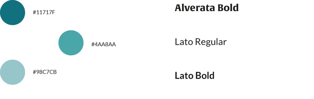
Also, The title’s typeface, Alverata Bold, was selected for its resemblance to the film’s title, offering a cohesive visual link. Lato Regular and Lato Bold Italic were used for readability and to emphasize key information in the article.
I decided to extend my design skills to the iPad version of these articles, creating a layout that provides a fluid and engaging digital reading experience on tablet devices.
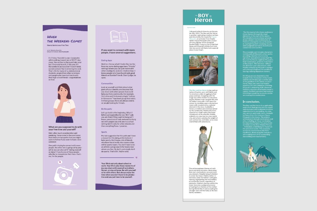
I also tailored the design for mobile, ensuring that the engaging content and visuals from the Link magazine articles are accessible and reader-friendly on smaller screens for a seamless on-the-go experience.
Reflecting on the project
The project designing and illustrating articles for BCIT’s Link magazine was a rewarding experience. The integration of vibrant illustrations with thoughtful color palettes and typography created engaging reading experiences across print and digital platforms.
Looking back, better communication with stakeholders and user feedback could enhance future projects. Nevertheless, the project taught valuable lessons in balancing creativity with functionality and adapting designs for various mediums.
Overall, the project was successful, and I’m excited to apply these insights to future endeavors, ensuring continued growth and improvement.