In the COCOBEAN Coffeeshop branding project, the design strategy was to create a visually appealing identity that resonates with its unique character — a fusion of health-conscious, eco-friendly ethos, and luxurious ambiance.
The logo and branding elements, such as packaging, cups, cards, and signage, reflect this blend of sustainability and sophistication, aiming to attract a diverse clientele in West Vancouver who value both wellness and premium experiences.
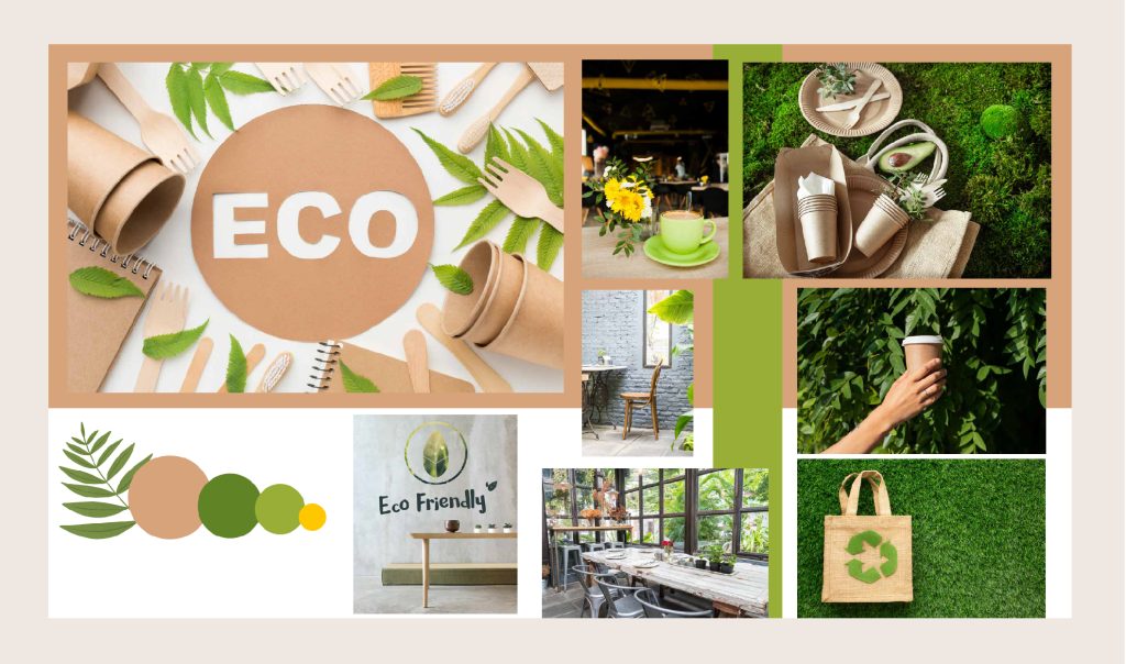
Gathering these images has been really helpful for channeling the eco-friendly spirit of the coffeeshop, providing me with the perfect inspiration to design a logo that’s as green and sustainable as it is stylish.
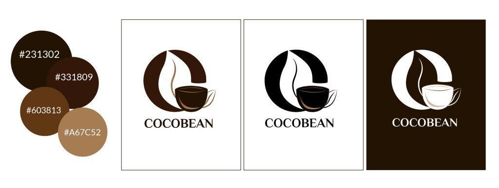
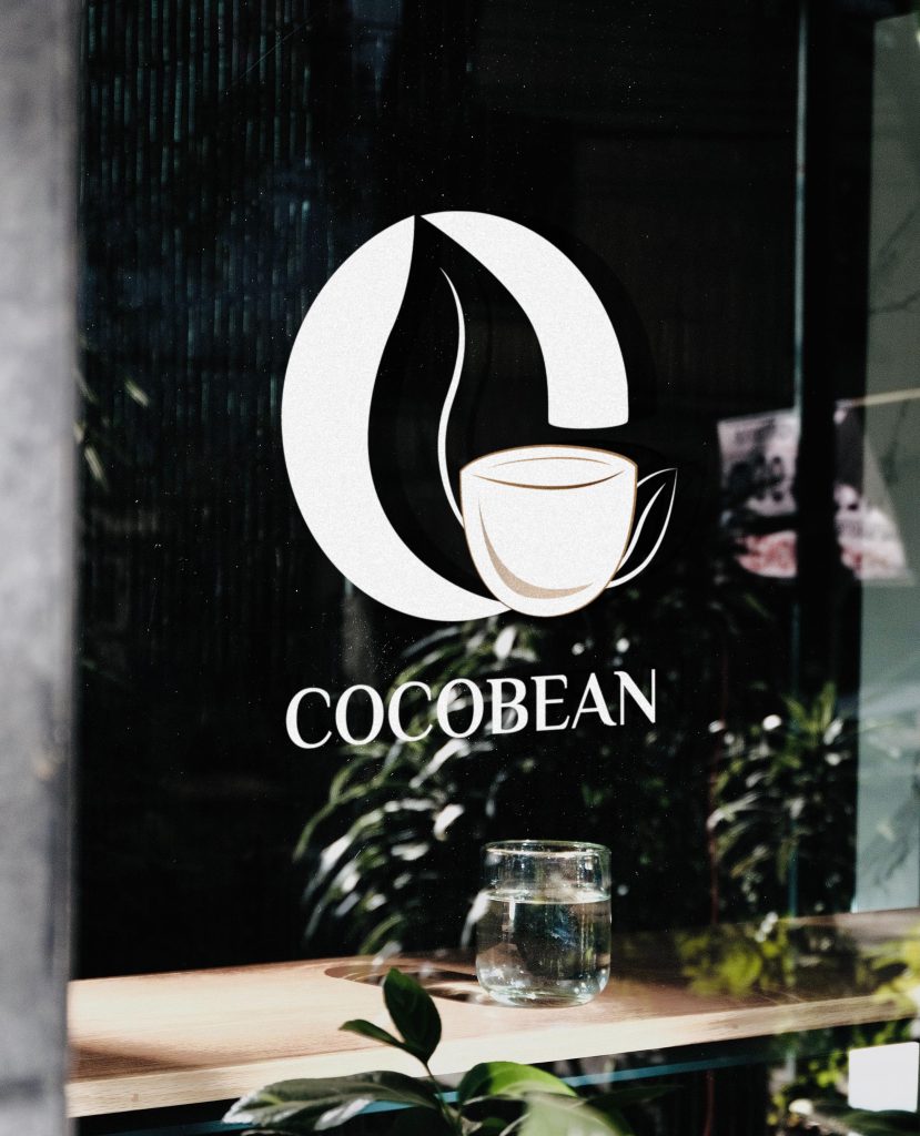
The primary logo I designed for COCOBEAN Coffeeshop captures the essence of the brand with its clean, organic lines, mirroring the natural and eco-friendly ethos of the company. For the secondary logo, I maintained the same theme while incorporating the full brand name, creating a cohesive identity that’s both memorable and sophisticated, perfectly suited for the clientele in West Vancouver.
In crafting the color palette for COCOBEAN, I selected shades that evoke the rich, organic warmth of coffee, enhancing the visual identity with a nod to the natural, sustainable ethos of the brand. The versatile color scheme translates seamlessly across various applications, ensuring the logo maintains its inviting and sophisticated charm on any background.
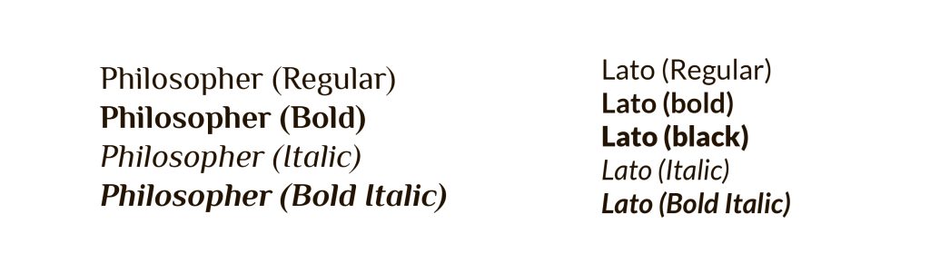
For the COCOBEAN logo, I selected Philosopher Bold for its strong yet fluid lines that resonate with the brand’s natural ethos. I also paired it with Lato for its clean simplicity on our packaging, providing a modern and legible complement to the primary branding.
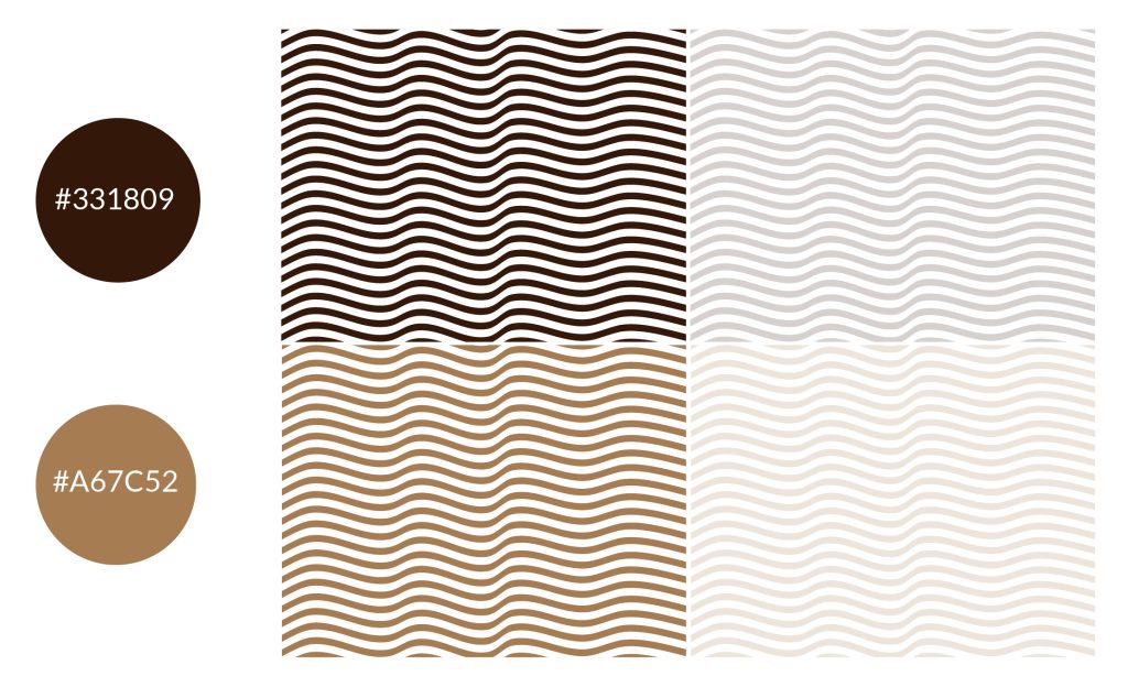
I created this wavy pattern for the coffeeshop, mirroring the fluidity of coffee and the organic nature of our brand. Displayed in both 100% and 20% opacity, it complements the COCOBEAN logo with versatility and a subtle, natural elegance.
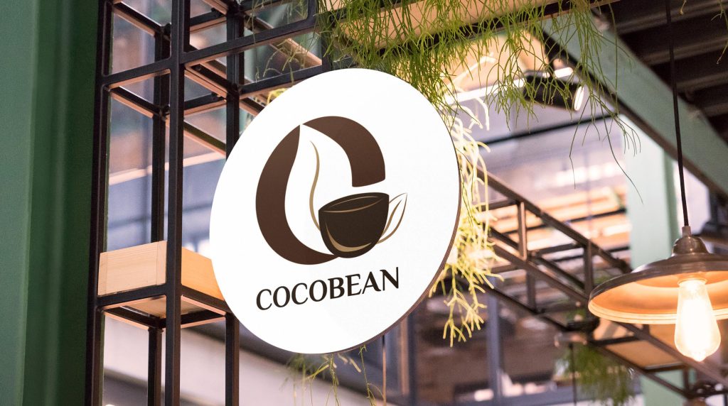
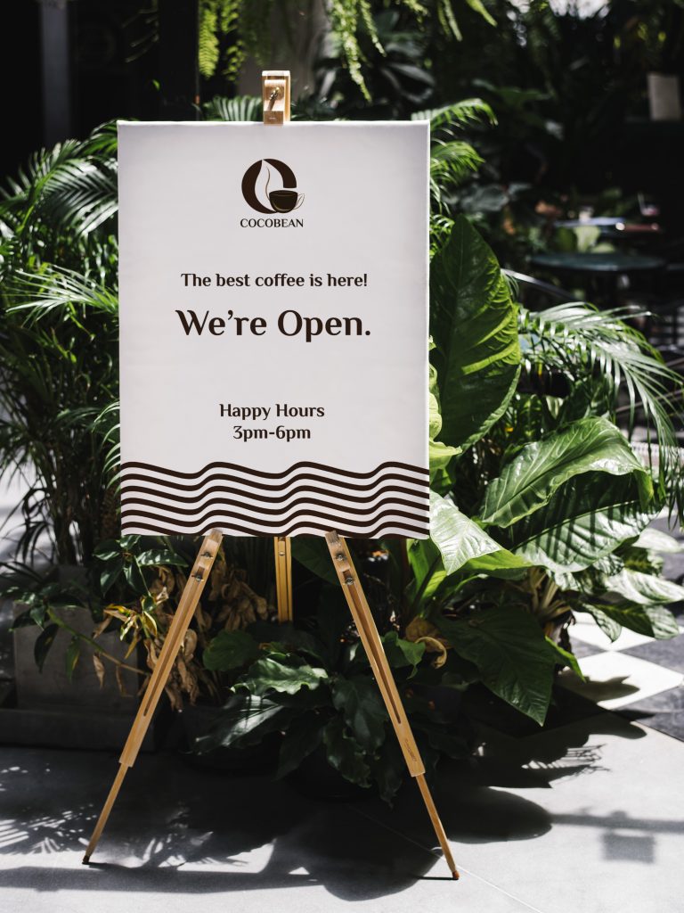
These are the signages I designed for the COCOBEAN Coffeeshop, incorporating the logo and pattern to create inviting and clear visual cues for the customers.
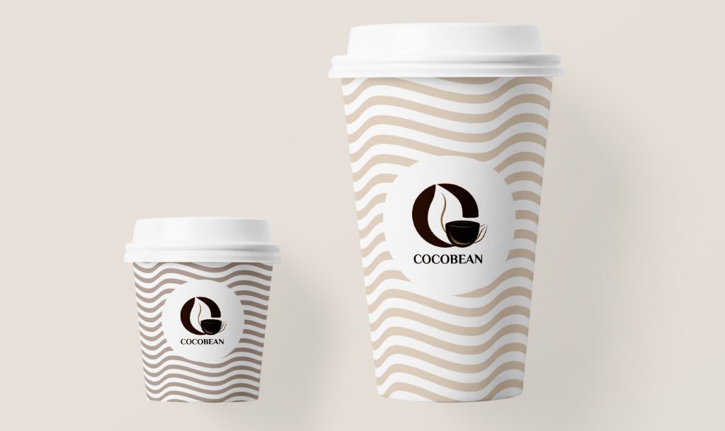
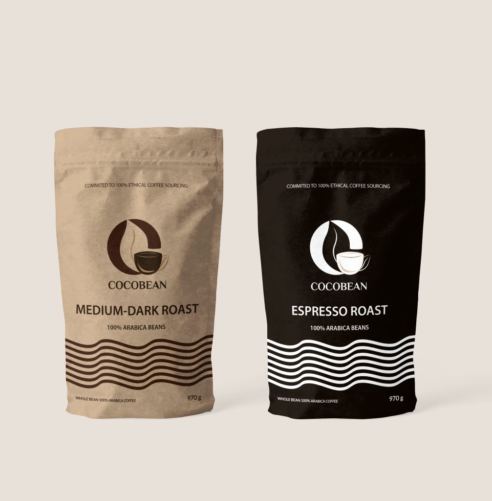
I used the pattern at 20% opacity for the cups and bag to give a soft, textured look that’s easy on the eyes, complementing the COCOBEAN logo without overwhelming it. The design feels organic and modern, just like our coffeeshop.
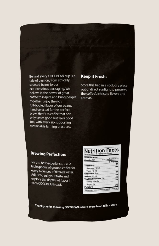
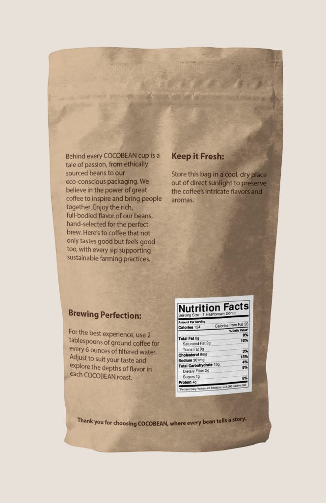
Here are the front and back designs of the COCOBEAN coffee bags: the front highlights the commitment to ethical sourcing, and the back offers brewing tips and freshness advice for the customers.
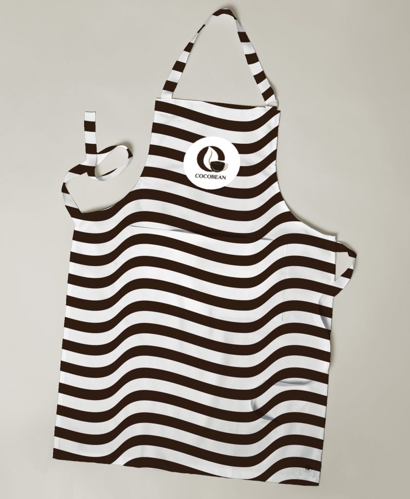
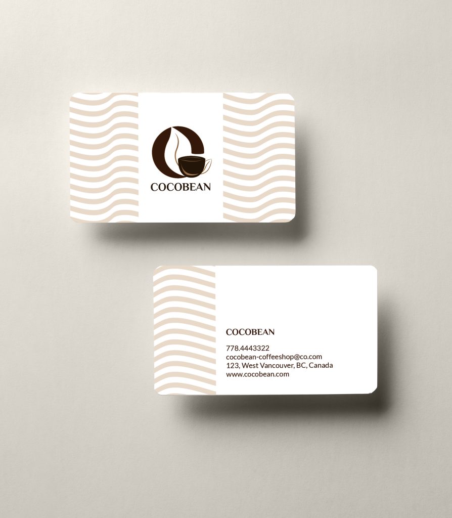
The apron design carries the bold wavy pattern full strength, making it a distinctive uniform that’s both functional and aligned with the branding. For the business cards, I opted for the pattern at 20% opacity to maintain subtlety and professionalism, ensuring our contact details are clear and prominent.
Reflecting on the project
Reflecting on the COCOBEAN project, I’m pleased with the cohesive brand identity I’ve achieved. A key lesson learned is the importance of a cohesive visual identity across all elements, from logos to packaging, which not only appeals to the target market but also stays true to the brand’s core principles. This experience will definitely serve as a valuable blueprint for future projects.