A mobile app that takes the stress out of dressing kids. Parents create a child profile once and get a personalized space with clothing picks for their child. An AI stylist is always available for outfit ideas, sizing help, and budget-friendly recommendations.
THE PROBLEM
Parents find it hard to shop for kids clothing on mobile. It takes too long, results are not relevant to their child, and most apps treat all parents the same without considering differences in budget, style, or sizing needs.
THE GOAL
To design a mobile app that makes children’s clothing shopping faster and more personal. By letting parents build a child profile and access an AI stylist, the app removes the guesswork around sizing, outfit matching, and budget, so parents can find the right clothes without the usual back and forth.
RESEARCH
COMPETITIVE ANALYSIS
To understand the landscape, I reviewed four apps that parents currently use to shop for children’s clothing, two direct competitors and two indirect. I looked at each app through the lens of a busy, budget-conscious parent, evaluating navigation, personalization, checkout experience, and overall UX quality. The goal was not just to find what competitors do wrong, but to understand what they do well and where a real gap exists for Bibbly to fill.
Direct
Direct
Indirect
Indirect
Strengths
• Affordable pricing options available across competitors • Strong filtering and large catalogues • Behavior-based product recommendations available in some apps • Daily deals, promotions, and community features • Multilingual and accessibility support in larger brands
Weaknesses
• Recommendations are behavior-based, not tied to a child’s profile or size • No conversational AI stylist available in any competitor • No automatic deal surfacing based on a child’s specific size • Cluttered or overwhelming UI in most apps • Kids-specific focus missing in larger brands like H&M
Opportunities
• Profile-based personalization that knows your kid before browsing • AI stylist for outfit, sizing, and style questions conversationally • Automatic deal surfacing by child’s size so parents save without searching • Clean, kids-only experience designed to reduce overwhelm • Fast, time-saving checkout
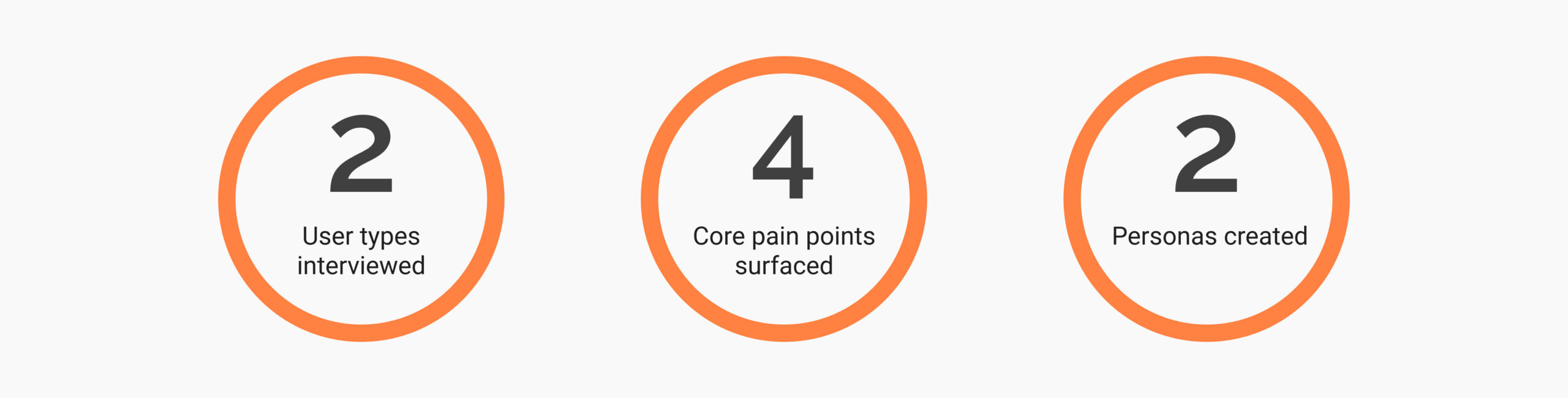
USER RESEARCH
I also conducted interviews with parents across two groups, busy professionals and budget-conscious parents, to understand their real experience shopping for children’s clothing.
I initially assumed affordability would be the top concern for everyone. The interviews challenged that assumption and revealed that each group had distinct priorities, which shaped the direction of Bibbly’s design.
PAIN POINTS
01
Not enough time to shop
Many parents struggle to find time for shopping due to demanding work schedules and family responsibilities, needing solutions that save time and streamline the process.
02
Too many choices online
The vast number of clothing options available online can be overwhelming, making it hard to choose the right items quickly and confidently.
03
Shopping on a budget
Managing a fluctuating income creates challenges in finding budget-friendly clothing options that do not compromise on quality.
04
Guessing sizes online
Without knowing a child’s exact measurements, parents often order the wrong size, leading to returns, wasted time, and frustration.
DEFINE
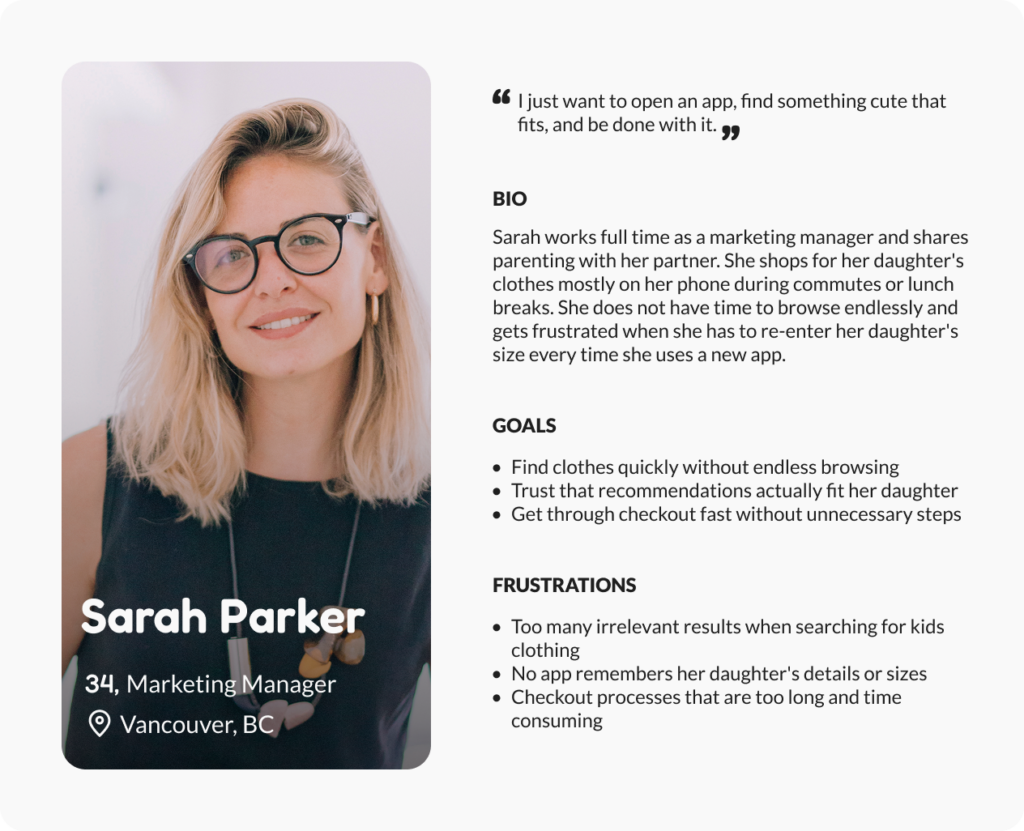
PERSONAS
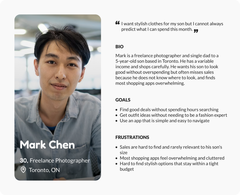
To keep Bibbly grounded in real people rather than assumptions, I created two personas from my research. They represent the two distinct parent groups I identified.
Sarah, the efficiency-focused working mom who needs to shop fast and trust the fit, and Mark, the budget-conscious dad who wants good value and a simple experience. These two shaped every decision that followed.
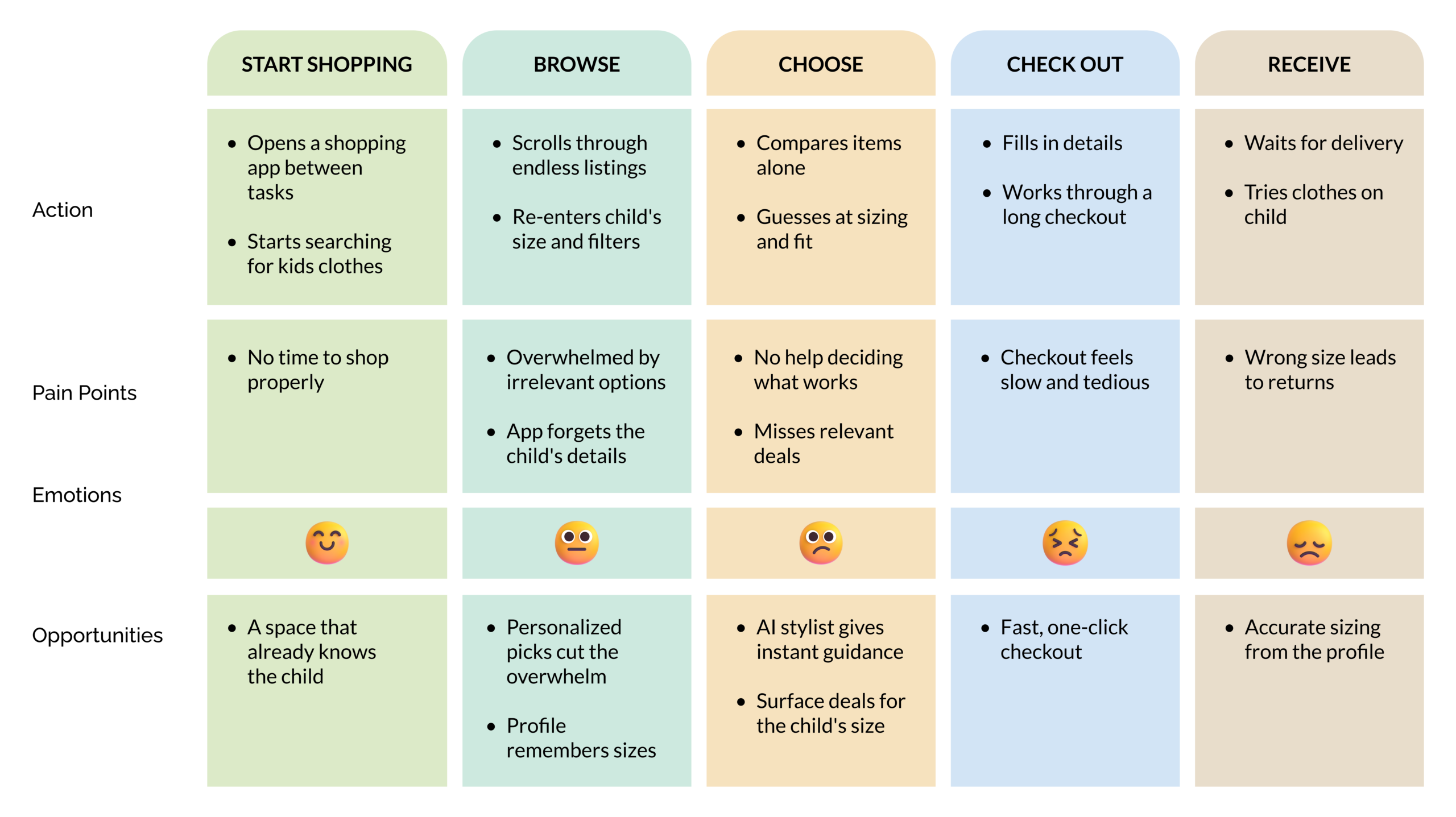
USER JOURNEY MAP
Using insights from the parent interviews, I synthesized their experiences into a journey map showing how they shop for kids clothing today with existing apps. Tracing their emotions across each stage revealed where frustration builds and where Bibbly could make the biggest difference.
HOW MIGHT WE
How might we help busy, budget-conscious parents find the right clothes for their child faster, without the overwhelm of irrelevant options or the frustration of starting from scratch every time they open a shopping app?
Who
Busy professionals and budget-conscious parents shopping for their kids on mobile
Problem
Existing apps show irrelevant results, do not remember child details, and make every visit feel like starting over
Insight
Parents do not all shop the same way. Efficiency and affordability are equally important but for different reasons
IDEATE
USER FLOW
Before moving into wireframes, I mapped the two moments that matter most in Bibbly. The first time a parent sets up their child’s profile, and the moment they turn to the AI stylist for help. These are not the complete app flow but focusing on these two helped me make sure every screen had a clear purpose before I started designing.
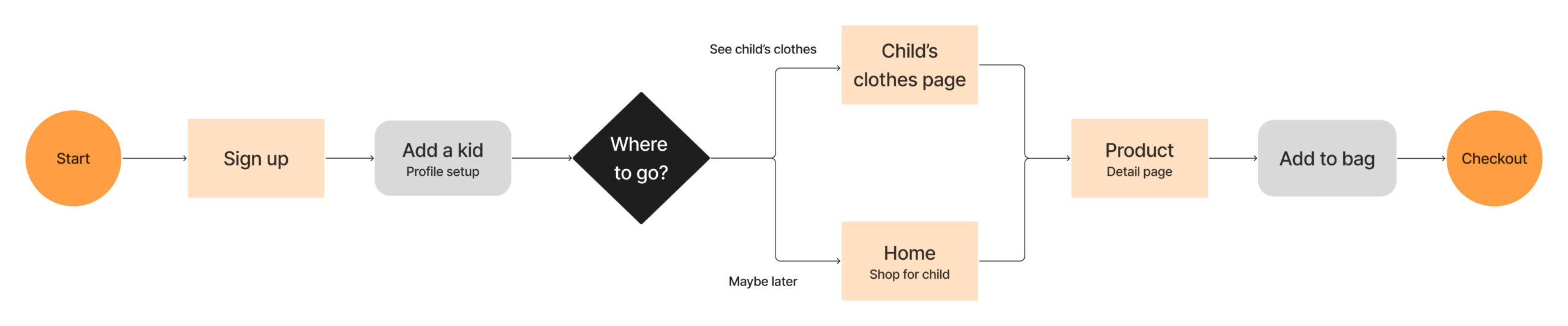
Flow 1 — Setting up the child profile
This flow captures the moment Bibbly becomes personal for the parent.
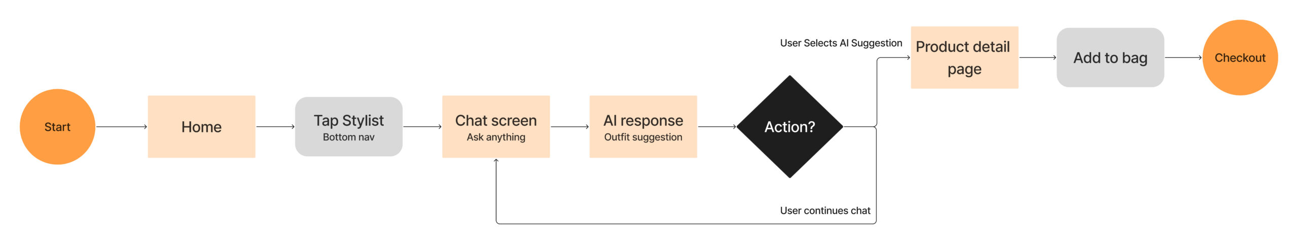
Flow 2 — AI stylist interaction
This flow shows how the AI stylist fits naturally into the shopping experience without interrupting it.
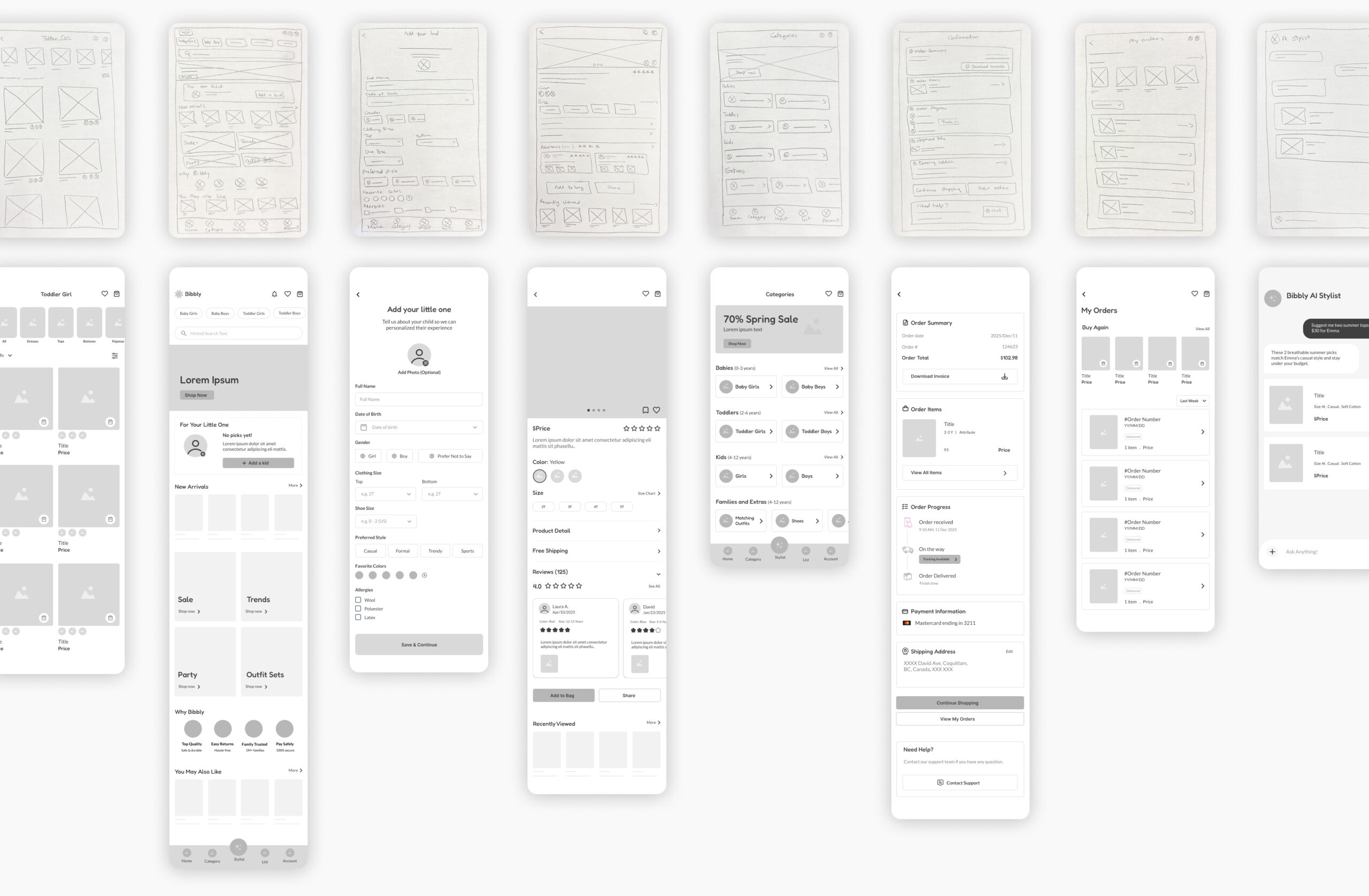
WIREFRAMES
After mapping the key user flows, I sketched the main screens to quickly visualize how the app would feel and function. The focus at this stage was on layout and structure, making sure the most important actions were easy to find and the experience felt simple for a parent with limited time. From there I moved into Figma, building mid-fidelity wireframes to refine the layout, hierarchy, and screen flow before introducing any visual design.
PROTOTYPE
I turned the mid-fidelity wireframes into an interactive prototype to test the core flows end to end, from setting up a child’s profile to checking out and chatting with the AI stylist. Prototyping at this stage let me experience the app the way a parent would and catch friction before investing in visual design.
Child profile setup flow
AI stylist flow
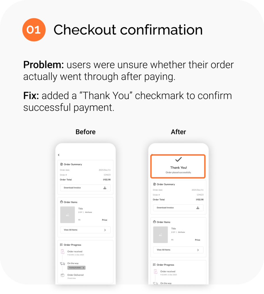
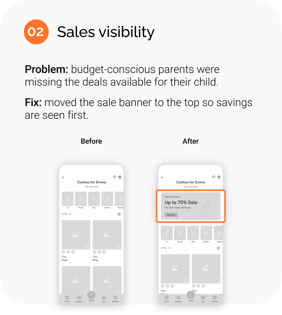
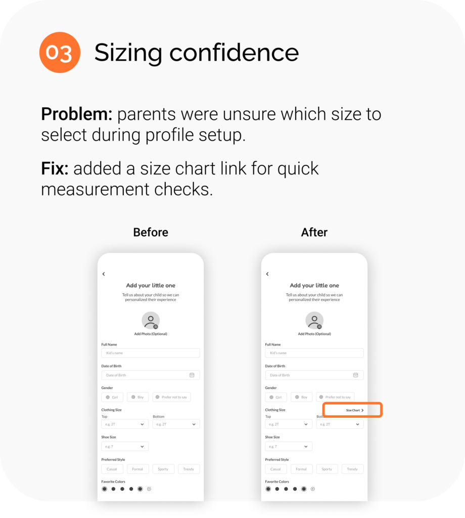
USABILITY TESTING
I tested the mid-fidelity prototype to evaluate Bibbly’s experience and surface friction points before high-fidelity design. Testing at this stage kept feedback focused on structure and flow rather than visual details.
5 parents
Participants aged 25 to 45
Remote
Unmoderated study
20 – 30 min
Per session
3 findings
Key friction points fixed
Each finding led to a focused change that made the experience clearer and more reassuring. Here are the three improvements that came directly from testing.
DESIGN
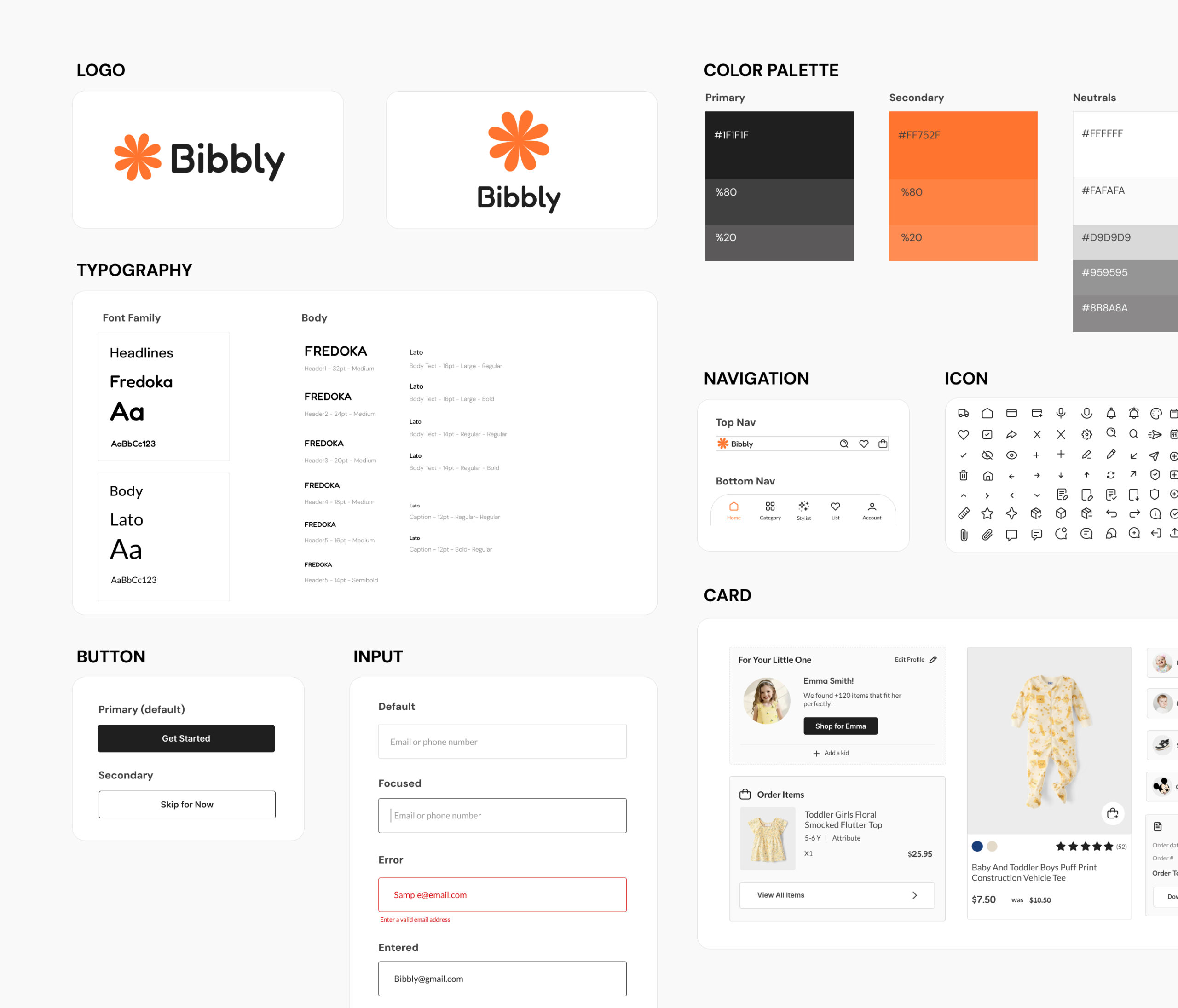
STYLE GUIDE
With the structure validated through testing, I moved into visual design and built a style guide to keep Bibbly consistent and scalable.
The system pairs a friendly, rounded logo and Fredoka headlines with clean Lato body text, balanced by a warm orange accent that brings energy without overwhelming. Every component, from buttons to product cards, was designed to feel simple, approachable, and easy for a busy parent to navigate.
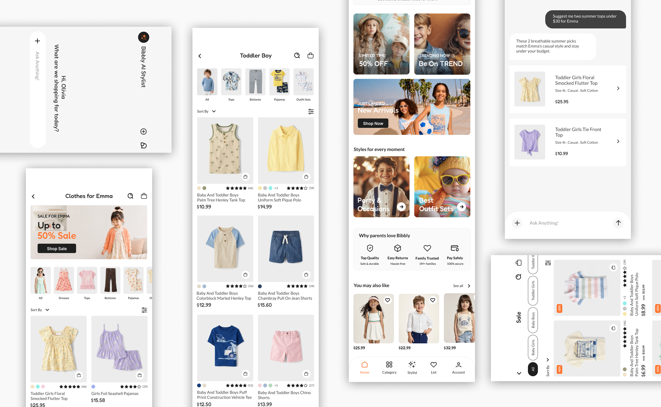
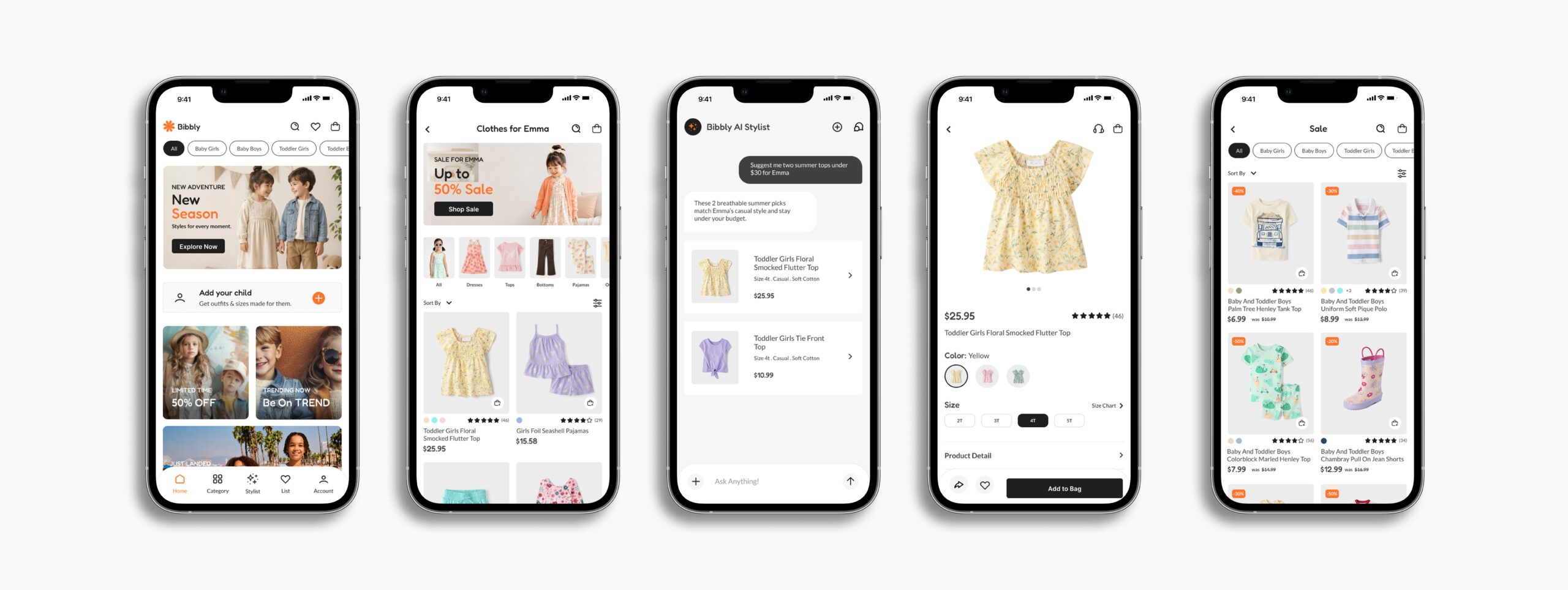
FINAL DESIGN
After research, two competing user paths, and usability testing, this is where everything comes together. Below are a few screens that capture the heart of the platform.
See the full experience in the working prototype, from browsing and donating as a guest to launching and managing a campaign.
INTERACTIVE PROTOTYPE
See how the complete app comes together, from setting up a child’s profile to browsing, chatting with the AI stylist, and checking out.
REFLECTION
KEY TAKEAWAYS
Splitting parents into efficiency-driven and budget-driven users shaped every decision. Testing at mid-fidelity caught structural issues early, saving time before visual design. Accessibility details like clear touch targets, strong contrast, and labeled icons kept the app usable for every parent.
NEXT STEPS
• Test the high-fidelity designs in a second usability round.
• Expand the AI stylist with saved outfits and seasonal picks.
• Support multiple children per account for larger families.