Zinat Nayebzadeh

PROJECT SCOPE

End-to-End Responsive Web Platform

ROLE 

Sole UX/UI Designer and Researcher

YEAR 

2025

DURATION

4 Months (Sep to Dec 2025)

UNITYPATH

Giving made fast, transparent,

& trustworthy

A charity fundraising platform with two clear paths, fast and trusted giving and credible, transparent campaign creation, backed by a full organizer dashboard, designed from research all the way to handoff.

THE PROBLEM

People who want to give or raise money for causes they care about need a platform that is fast, clear, and trustworthy for both urgent donors and campaign organizers. Existing platforms force account creation, hide fees, and lack proper verification, so people lose momentum and abandon their intent at the exact moment they are most motivated to act.

THE GOAL

To design a platform that serves both donors and fundraisers through two clear paths, one built for speed and trust in giving, and one built for credibility, transparency, and campaign management. Success would be measured through donation completion rate, campaign setup completion rate, and trust indicators like repeat giving and verification badge engagement.

WHAT DID THE CLIENT ACTUALLY NEED?

This was a client brief, so it arrived with a specific set of feature requirements. Before designing anything, I mapped each requirement to the business goal behind it, then grouped those goals into four themes so every design decision could be traced back to a clear business reason.

Frictionless giving

Let donors act in the moment and pay however they want.

Guest checkout, no account

Card, PayPal, cheque, and bequest

Transparent by default

Show all fees up front to donors and give organizers tools to prove credibility.

0% fee on emergencies, an open 15% admin fee on everything else

Identity verification & a campaign management dashboard.

Lasting support

Turn a single gift into an ongoing relationship with the cause.

Monthly donation toggle

Email capture for all donors

Amplify impact

Grow the size of each gift and the reach of every campaign.

Rope bracelet for $85 and up

Social sharing after donation

RESEARCH

COMPETITIVE ANALYSIS

I reviewed three leading donation and fundraising platforms to find where each falls short, and where UnityPath could fit.

Strengths

• Fast setup with huge reach
• Deep trust through charity vetting and verification
• Familiar payment options and recurring giving

Weaknesses

• Fees hidden behind optional tip and contribution prompts
• Verification tied to formal charity status
• one generic flow with thin tools for managing a campaign

Opportunities

  • • Two clear paths, one for donors and one for organizers
    • Fast, trustworthy giving with fees shown up front
    • Verification and a management dashboard for any organizer, not just charities

Threats

• Entrenched incumbents with brand trust
• Donor skepticism toward a new platform
• Fee sensitivity pulls users to free options

USER RESEARCH

I interviewed donors and fundraisers across five archetypes, focusing on the two primary ones, an emergency donor and an institutional organizer.

My biggest assumption was wrong. I expected trust to be everyone’s top concern, but urgent donors cared more about speed, they would abandon a cause they trusted if the flow felt slow. Organizers were the opposite, willing to spend time if it helped them prove credibility.

That contrast shaped the whole project, donors get a fast guest path, organizers get a separate, credibility focused one.

PAIN POINTS

01

Friction at the front door

Mandatory account creation creates friction and prevents users from completing donations quickly.

02

A trust gap

Donors hesitated when they couldn’t tell where their money was going. Organizers had no way to show donors that their campaign was handling funds responsibly.

03

Unreliable flows

Donors lost confidence when a confirmation didn’t appear after giving. Organizers felt uncertain when campaign setup was slow and gave no indication of progress or status.

04

No credibility proof

Organizers struggled to show their campaign was legitimate, and had no tools to demonstrate transparency to stakeholders or donors over time.

DEFINE

PERSONAS

Two personas from the research anchored the work: Chloe, an emergency donor who needs speed and trust, and Kevin, an institutional organizer who needs to prove credibility.

HOW MIGHT WE

help donors give quickly and trust where their money goes, while giving organizers a fast way to launch campaigns people believe in?

Who

Emergency and recurring donors, plus grassroots and institutional organizers.

Problem

Existing platforms force account creation, hide fees, and make legitimacy hard to prove.

Insight

Donors need speed and trust; organizers need credibility and easy setup. One flow fails both.

BUSINESS GOALS VS USER NEEDS

Not every business requirement matched what users needed. Here’s where they agreed and where I had to resolve the tension.

Aligned, for different reasons

Fast donation flow

Fee transparency

Verification

Confirmation and updates

Clashed, and how I resolved it

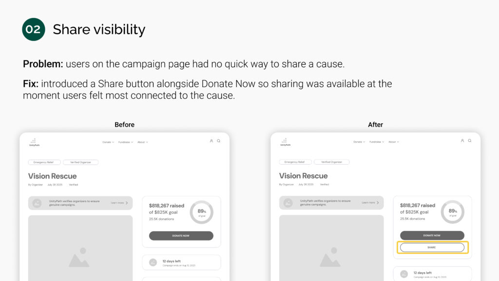
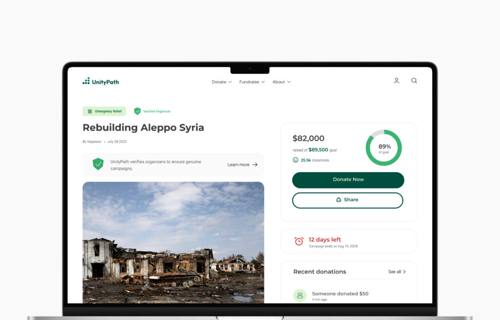
Client wanted automatic sharing, users valued privacy.

✔ Sharing stays optional

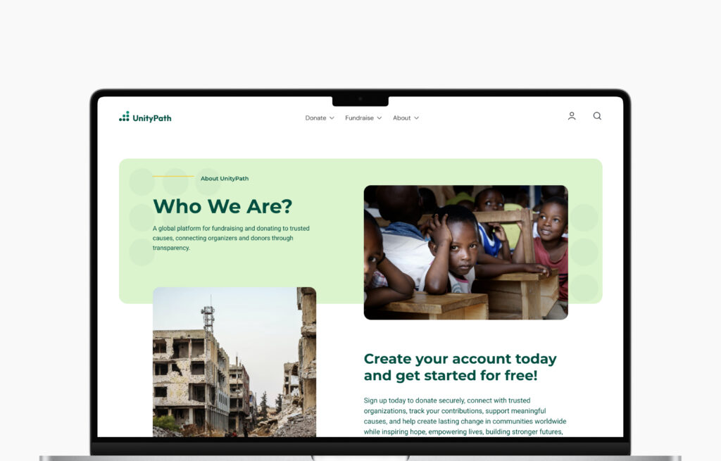
Client wanted every donor’s email, donors resist extra steps.

✔ Newsletter on confirmation page,
after giving.

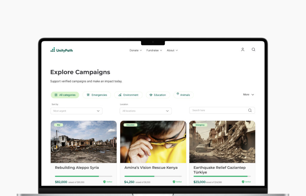
15% admin fee is necessary; users distrust hidden costs.

✔ Fee shown at category selection, before payment.

IDEATE

USER FLOW

Before wireframing, I mapped the two core paths through the platform:

A donor giving as a guest, and an organizer building and submitting a campaign. The flow surfaces the key decisions, the identity check, the admin approval gate, and the moments where the system takes over, so every screen had a clear purpose before design began.

SITEMAP

I built the sitemap around the top navigation and its hover menus, since that is how users orient themselves on the platform. It maps four main sections, Donate, Fundraise, About, and Account, across four levels from global navigation down to dashboard sub-pages, with dynamic pages marked separately since they are generated by user action rather than permanent destinations.

WIREFRAMES

With the two user paths defined, I moved straight to paper to work out structure before committing to anything digital. Each sketch focused on one question: does this screen make the next step obvious? From there I took the strongest layouts into Figma, building mid fidelity wireframes to test hierarchy and flow across the donor and organizer paths before any visual decisions were made.

PROTOTYPE

I connected the mid fidelity wireframes into an interactive prototype to walk both paths from start to finish, a guest donor completing a donation and an organizer taking a campaign from setup through submission. Having a working prototype at this stage made it possible to run structured usability tests on real interactions before any visual design work began.

Donation flow

Campaign flow

USABILITY TESTING

I tested the mid fidelity prototype across both user paths to surface friction points before moving into visual design. Keeping tests at this stage meant feedback stayed focused on structure and navigation rather than appearance.

5 participants

Donors and organizers

Remote

Unmoderated sessions

30 min

Per session

4 findings

Key friction points fixed

Each finding led to a focused change that made the experience clearer and more reassuring. Here are the four improvements that came directly from testing.

DESIGN

STYLE GUIDE

With the structure validated through testing, I moved into visual design and built a style guide to keep UnityPath consistent and scalable.
Deep forest green paired with a warm amber accent balances trust and urgency for a charity platform. Montserrat leads headlines, Roboto handles body text, and every component from donation cards to form inputs was designed to feel credible and easy to navigate for both user types.

FINAL DESIGN

After research, two competing user paths, and usability testing, this is where everything comes together. Below are a few screens that capture the heart of the platform.

Browse campaigns

Organizer dashboard

Campaign page

About

INTERACTIVE PROTOTYPE

See the full experience in the working prototype, from browsing and donating as a guest to launching and managing a campaign.

REFLECTION

KEY TAKEAWAYS

Designing for two opposite users inside one product forced every decision to be deliberate. The hardest part was the tension between what the client needed commercially and what users needed emotionally, and resolving those conflicts through design was the most valuable thing this project taught me.

In practice the two paths aren’t separate people. One account can both give and fundraise, so the logged-in experience adapts, showing donation history to donors and the campaign dashboard to organizers.

NEXT STEPS

• Test the high fidelity designs in a second usability round.
• Build out the Charity Advisor flow for legacy and bequest donors.